Wet Paint: Redesigning Dead Man’s Snitch
We just launched a new version of Dead Man’s Snitch with a considerably simpler design aesthetic. Going in I had a few goals. The new design needed to be simpler. It needed to enhance the user experience. It also needed to be more accessible, and that is where I started.
New Status Indicators
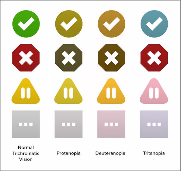
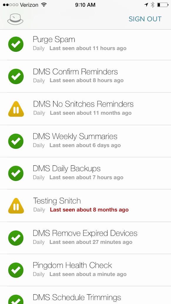
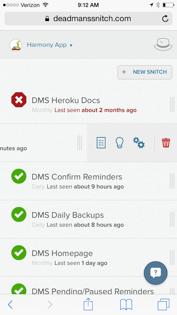
Dead Man’s Snitch has status indicators to make scanning your list of snitches faster. Something we didn’t catch in the previous version was that the red, yellow, green system for identifying the status of a snitch meant that if you were color blind, you probably couldn’t tell the difference between a snitch that was checking in and one that wasn’t. That’s clearly a bad thing and an oversight that was important to fix. Increasing the ability to identify and scan the snitch list was going to be good for everyone. Not only are the icons now different shapes, but they also have characters inside of them in white to make them identifiable at a glance. The result are a set of icons that communicate what they mean to anyone.
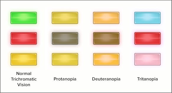
The old status indicators & what they looked like like to colorblind eyes.
The new status indicators & what they look like to colorblind eyes.
Revised Interface
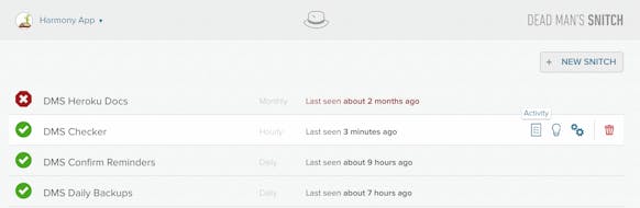
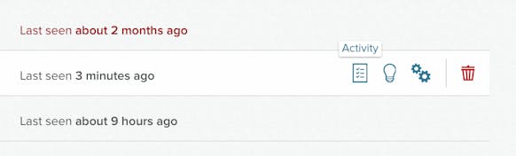
Once I had a handle on how the icons were going to look, I moved into the interface. The new icons really necessitated a change since they benefitted greatly from having white space around them and not being contained in a box. The new interface removes extra elements in favor of a cleaner content driven style. You can click anywhere on a snitch and get to it’s page. You can click directly into any section of a snitch’s page as well as pausing and deleting snitches from a new set of icons on the right of each row. This makes working through large lists of snitches a more pleasant and speedy experience.
Completely New iPhone App
The Dead Man’s Snitch iPhone app has been completely redesigned and rewritten in Swift (which was handled by Tim Bugai and Chris Rittersdorf). It’s faster, looks awesome, and lays a great foundation for us to bring more features from the web app into the iOS version. We are really excited about how it turned out and are looking forward to what we will be bringing to it in the future. The entire app is built to take advantage of any iPhone screen from the iPhone 4 through the iPhone 6 Plus. We did this with the new auto-layout features of Xcode. Depending on the size of the device the layout will adjust and scale.
Next Level Mobile Experience
The iPhone app doesn’t have the full functionality of Dead Man’s Snitch but the new mobile web app does! Matt Slack and I worked really hard to make sure that the app was completely optimized and usable on mobile devices. Certain parts of the interface had to be rethought to fit all of the content onto tiny screens. For instance, instead of hovers for getting to the tools for each snitch, you swipe in from the right because on mobile, you don’t hover, you tap. The page layouts are also all optimized for being highly usable on small screens. You can do anything on a mobile device that you can on a desktop.
If what you just read sounded cool, and you haven’t tried it already, Dead Man’s Snitch is a web and mobile application produced by Collective Idea. If you have daily backups, monthly emails, or hourly cron jobs you need to monitor Dead Man’s Snitch is for you. With it you can monitor for cron, Heroku Scheduler, or any scheduled task. If they don’t execute when they should, DMS alerts you.
You can take it for a spin at deadmanssnitch.com
About Victor Sirotek
Victor is both a manager of expectations and a designer of experiences for Collective Idea. He’s enjoyed leading projects, designing apps, and creating thoughtful experiences since 2002.
Comments